Tuesday, May 28, 2013

Be Inspired No. 44 - Explore


Explore stillness...


Explore solitude...


Explore calmness...


Explore reflection...


Explore quietness...


E X P L O R E.


Image Sources:  Hotel Villa Fontelunga, Will Wick, Melanie  Turner 


Friday, May 24, 2013

Color Palette No. 12 - Chocolate and Vanilla Twist


Yup, it's summer time and I'm your typical chocolate and vanilla twist cone girl.  But when the rest of the line is gawking at the long list of creative concoctions available at the local ice cream shoppe, my ice cream is already in my hands.  Sorbet is a bit different - but that's for another conversation.


The pureness of chocolate and vanilla as a color palette is not one that demands restraint.  I love the backdrop this combination offers for exquisite carvings, marvelous objects d' art, graceful curves, and delicate pattern.  Even still, with all that, holds a clean and calming effect on the room's character.


Okay, so once in a while you decide you will see what all the fuss is about, and add a few sprinkles or crushed pistachios to your cone.  The innocence of this color palette hasn't been lost.


Are you seeing that ottoman at the fireplace?  Vanilla is anything but boring!


Okay, so you ask for a cherry on top of the cone, just this once.


Careful, your sorbet is showing!

My paint color picks for this color palette are easy.  And please, don't think too easy means you have to keep looking.  It doesn't.  Plain and simple.

Benjamin Moore BM2113 Chocolate Sundae

Benjamin Moore OC090 Vanilla Ice Cream


Image Sources:  Barry Dixon, House Beautiful, Elle Decor, AD, Benjamin Moore


Thursday, May 23, 2013

At the Window No. 6 - The Lambrequin


The window, the blank canvas of the room.  If you are a frequent reader of this blog, you know I am not a fan of window treatments that make no statement.  The lambrequin does not fall into that category.

The design not only encapsulates the fabric but also the shape.  The lambrequin is not for the weak, it is for the one who knows that a room is not complete unless it is evident that every part of the design was given just as much attention as the inspiration that started the dream in the first place.

Hail to the lambrequin!

Loving the transitional flair.


What partners the roller shade and lambrequin make!


The simplicity almost brings me to tears.


Image Sources:  Elle Decor, Rowley, House Beautiful, Perch, Chez Elza


Wednesday, May 22, 2013

Gotta Love No. 29 - Molten Metallics


The imagery that comes to my mind when I think of molten metals is one of industry, hard work, factories, huge pots, brilliant colors ablaze with intense heat, and...I'm not going to lie...workmen with muscles.

Benjamin Moore has introduced  the Molten Metallics high-gloss paint collection which creates the illusion of hand-hammered metal.  The color palette offers gold, copper, bronze, gun smoke, silver, and charcoal.

This is a no-brainer people...it is a must for the ceiling! 


The effect of the molten metallic paint brushed on 
a board ceiling - give me a moment to recompose.


But do not limit this marvel to just the ceiling - the possibilities are endless - wood trim (yum), backs of built-in bookcases (be still my heart), a table top (shut the front and back doors), picture frames (give me an amen), wooden cornices or lambrequins (okay if you aren't grabbing your keys to buy a gallon...).


Image Sources:  Elle Decor, House Beautiful, Decorista, Apartment Therapy


Tuesday, May 21, 2013

Rethinking the Look of Things, No. 26 - Sea Legs


The memories of watching our son and daughter running in the sand with their buckets to collect the prettiest (our daughter) seashells and the most unusual (our son) early in the morning are  part of my fondest of summer.

I suppose that is why the discovery of an amazing piece of coral while antiquing a few years ago was a day I won't forget.  It's one of those pieces you clutch all the way to the front counter so as not to have it stole away by a jealous treasure hunter.  


These sea treasures can evoke a story in our home in many forms.  


Loving this brave display of many travels to the coast - especially the magnifying glass, 
to catch all the wonderment of the treasures.


Yes, this room will give you wrinkly fingers because you won't want to exit the water.


When books are just so predictable - sea legs conquer.


This Spore Mirror - l.o.v.e.

Find your sea legs and add your story with a special piece of this wondrous part of nature!


Image Sources:  Arteriors, Architectural Digest, Florida Design, Elle Decor

Monday, May 20, 2013

Be Inspired No. 44 - Hermes Scarf


I have a dream list!  And I have things crossed off that dream list.  Not because I think they are unattainable, rather because I have attained them.  But for every item I cross off, there is more items added.  Never, ever stop defining and visualizing your dreams.  Never, ever!
Share with me the visualization of one of my dreams - to own not one, but many Hermes scarves.  Not being greedy, but I need many.  Some for wearing, some for artwork.


Yup, an equestrian themed one is on my list!


This room just doesn't stop - but my eyes continue to go 
to the framed 1960s Hermes scarf!


One word:  juxtaposition, Hermes style.


Watching this video on the making of a Hermes scarf broadens my dream list - go to France to buy those Hermes scarves.  After all, is it a dream accomplished if you just go to the nearest seller, I say no, it's a dream if you attain that dream at the source.  Bonjour! C'Est Si Bon!


Image Sources:  From The Right Bank, Maters of Style, The English Room, Interior Infatuations

Sunday, May 19, 2013

Well Dressed Home No. 26 - Tomfoolery on the Walls


tom·fool·er·y 
tämˈfo͞ol(ə)rē


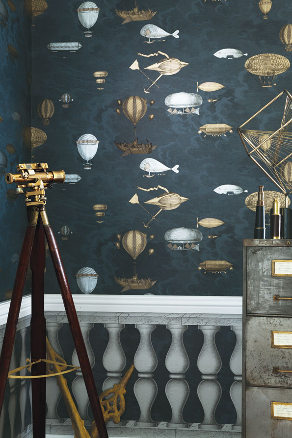
More of our days should be injected with a bit of tomfoolery.  Eccentric, playfulness, fantastical, theatrical.  Seriously!  This new wallcovering collection from Cole & Sons - Fornassetti II gives a bit of that for our walls and I love it!

Hooray for silliness in our Mudroom - greeting us after a long day!


Left to our own definition - not meant to limit the application of these wallpapers.


What writer wouldn't be inspired to bring forth their best work - even if 
it is a handwritten note to a dear friend?


The drama of this pattern called Procuratie is never ending.


I am totally loving what is created when one is brave enough to 
take that small powder room or alcove and get a bit silly.

Yes, I am all for a bit of tomfoolery showing.


Images:  Cole and Sons


Related Posts Plugin for WordPress, Blogger...