Monday, April 22, 2019

Be Inspired No. 88 - Solving the Long & Narrow Living Room Layout


It can be a challenge and is sometimes referred to as a "bowling alley" room. It's the long and narrow living room. So how can one achieve a comfortable, cozy furniture layout? Divide and conquer!


The layout for a long and narrow living room requires one to erase the typical living room layout from the drawing board. Focal points in this type of space add to the difficulty of space planning. There can be a limit to actual wall space for larger pieces of furniture because of windows and perhaps even a fireplace or built-ins.


It is vital that the focal points are identified along with traffic patterns. Be inspired, though to keep in mind that not all areas that may be deemed a focal point for one homeowner is a focal point for another. Your lifestyle dictates these focal points. For instance, access to built-in cabinetry may be an important part of one's lifestyle, but not others. 


Often for long and narrow living room layouts the most beautiful rooms consist of multiple seating areas that can easily allow for multiple uses in this space. A cozy reading area, a relaxed conversation area, a comfortable space to take in a favorite movie. All while allowing for a gathering of family or good friends to have an entertaining time together.


Another important consideration for a long and narrow living room layout is the overall visual harmony of these collective seating areas. Height and scale of pieces are especially important to prevent a visual division of the space. Divide and conquer isn't about literally dividing the room with furnishings. It is about giving the person walking into the space a warm welcome no matter where they choose to sit or how they choose to use the room in that moment.


Be inspired to play with texture, subtle pattern, eye candy accessories, ceiling treatments, dressing the windows to compliment the feel and lifestyle of the space. It is a challenge, but one you can achieve with determination. 


Image Sources: Pinterest, Coastal Living, Elle Decor, Southern Living 

Monday, April 15, 2019

When it Could be a Don't No. 12 - Mirror Hung on Window


I'm inspired by rebels as frequent reader of this blog already know. Normal has one viewing the windows in a living space to address privacy and add the finishing touch with fabric treatments. A rebel looks at the window as another wall space. I have to admit I have been overlooking the potential of the window.


I have shared artwork being hung on the window in this blog and with delight dared you to do it! 

But this idea of hanging mirrors on or in front of windows is taking the dare to the next level. It's a head turner!


Whether the mirrors are installed on sliding bar hardware or individually hung from the ceiling or side walls with specialty hardware, the layout of cabinetry placement options become more versatile. 


The beauty of suspension, pivoting, movement, reflection and layering are all design elements that happen when the mirror is hung in front of a window. Privacy is still something that can be addressed just like a window without the mirror. The natural light along with the reflection of the mirrors surroundings brings an heighten degree of interest to any room.


The mix of shape and scale of the mirror hung at a window compliments or interrupts the shape of the room. Possibilities are not endless. Wait, what? Rule? Where did the rebel go? Consider that the selection of the mirror and how it is hung is important because choosing to put a mirror in front of a window is not to hide the window. 


Street appeal is another factor when considering hanging a mirror at a window. What will the back of the mirror present to the exterior of the home. Even a rebel needs to pull off an off-the-wall idea with finesse. The lure of the achievement of a rebel is the appreciation of how the rebel pulled it off. The wonderment. The study of technique. The awe of the solution.


Design rebels unite.  Which window in your home looks bare? How would the layout of that room be different if the window was looked at differently?


Sources: House and Home, Elements of Style, Pinterest, Decorpad, Mile Redd, Home Bunch, Luxe Apothecary, Country Living, Pop Sugar, Instagram

Monday, April 8, 2019

Garden Design No. 25 - Temple Bells


When pursuing harmony and serenity we often believe it must be accompanied with silence. Scientifically a bell's ring clears our mind and helps us stay sharp and keep our concentration on devotional purpose while we are entering our inner sanctum. Hum?


The temple bell is rung once by those entering their temple to keep evil forces away and it is said the sound is pleasant to God. It's a favorable sound. That single dong. How wonderful would this be as an addition to our gardens? At its entrance it could be rung to give intention to our time we will spend in the gardens. Or perhaps it is hung further into the garden near our favorite mediation spot or where we "hide" from the day. 


And should a collection of temple bells be your display - how calming would it be to hear their song!


I feel your "temple" can be anywhere you create an environment that brings a space where one can reach that level of harmony - concentration to enlighten our soul. I love that a single sound that doesn't apologize for it's bold distinction clears our mind. I, for one need that. It is not the subtle whisper that aids in my disconnection from distraction - it is the strong announcement of a word or sound that proclaims it is time to take moments for myself. 


I look at the picture above and hear the song this collection of bells plays with a breeze being its conductor. I smile at the reflection from the sun of these bells on the rooftop. I dream about the saying I would etch in the pendulums hanging from the bells. And I find by breathing has calmed. Oh to be in the presence of this bell collection.


My love for secret hideaways sees a display of one's collection of temple bells creating a room divider in the garden. And I challenge the "wall" to be built even before the collection is complete to fill it. Why delay? Those empty areas will be filled in no time. Your soul will seek out the temple bells to fill it and they will find you.


"Today is only one day in all the days that will ever be. But what will happen in all the other days that ever come can depend on what you do today." (For Whom the Bell Tolls, 1940)


Sources: Viva Terra, Tumblr, Pinterest, Dutour Dumonde Photography, Science Behind Indian Culture, Ernest Hemingway

Wednesday, April 3, 2019

Be Inspired No. 87 - Bespoke Verre Eglomise


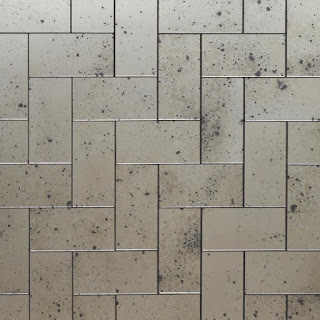
Verre eglomise is an ancient process of gilding with real silver or gold leaf on the reverse side of glass creating a mirror effect. The artisan's hand adds antique or distress to the metal leaf to resemble the degradation of mercury mirror plates. Beautiful, never the same, this pulse raising art is a breath taker.


Bespoke to be certain. Verre eglomise adds dimension and art on the wall of a space like nothing else can. Don't get me wrong in calling it art, because one can certainly hang art, gallery style on a verre eglomise wall without hesitation. 


Verre eglomise is not an afterthought in your room design. If must be a foundation to the planning with everything else coming as a layering onto it. The doppelganger created by the mirror's reflection is an important element in selection and placement of everything else in the room.


Let's not confuse verre eglomise with mirrored walls. It is art. Period. Be careful in your selection - if you are using a paneled application, be sure the size of the panels are on the larger size and right scale for the wall space you are installing them on. I recommend this because it will remain timeless over the years and work with future updates as your design preferences evolve. It is a statement, make sure it is making that statement.


Planning is vital. Verre eglomise isn't an "any space" design element. Once it has been determined your space beckons it go for it!


Metal selection, antiquing, distressing, embellishments are considerations that will need to be finalized. Perhaps your inspiration came from an old mirror you happened upon in the corner of that off-the-beaten-path shop cobwebbed. Or the inspiration came from an old penny you found on a walk on a familiar street. Use that inspiration!


This ancient gilding process is invited into a modern application too. Though not for the faint of heart, keep in mind it is a mirrored effect and mirrors are welcome because they reflect what we love.


Be inspired to consider a non-trendy design element. Your inspiration shouldn't always come from what everyone else is doing, what is featured in this month's shelter magazine publication, what is on this week's design show. History repeats itself and continues a story that can start from falling in love with something that catches our eye and becomes what everything else in our room design grows from.


Texture, color, shape, size, bevel. All create your bespoke verre eglomise. Where will it take your design?


Be inspired!


Sources: Old Rough Glass, Dominic Schuster, Studio Fulton, Simes Studio 
Related Posts Plugin for WordPress, Blogger...