Friday, August 7, 2020

Be Inspired No. 11 - Leather Walls


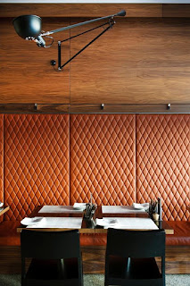
Sometimes when we are designing a space the walls are left to a simple paint choice. Emphasis is put on the space plan and then the fabrics, textures, finishes, and color of the furnishings. These are definitely important elements of a well-designed space. And the wall color plays a part in bringing it all together. However, I believe that texture is also a priority for the walls.

Be inspired to think textile for the wall, namely leather or a great faux leather.


Leather walls are clever, seductive, and embracing. Be inspired to explore this option for your room design. Just be careful with the selection - make it timeless. Be careful with the color - make it classic. Be careful with the amount of wall - make it a great partnership between leather and wood mouldings or function in place of wood. 


The leather wall takes precise planning. There is pattern match, panel size and layout that are all factors in a leather wall design. Use a top quality leather or faux leather and a top notch installer. This is an investment just like the rest of the furnishings in your room make a wise one. Leather walls are not a trendy temporary addition to a room design. Plan carefully.


Now you have all the warnings and recommended precautions and you've made the decision to go for it! Now have fun with it. Pull all the swatches and finishes for the space and select a great leather or faux leather, draw out the pattern and placement and consider adding nailhead to your plan.


Let your walls speak, like leather bound books, let them tell a story.


Speaking of walls, be inspired.


Sources: Spinneybeck, David Linley, Jarvis Studio, Embassy Row Hotel-Washington, DC, Plumetis Magazine


Tuesday, July 21, 2020

Rethinking the Look of Things No. 65 - Tattoos


If my kids saw my browser search history lately they might get a bit worried about Mom because the word "tattoo" would show up in excess. Ever since I came across the Dan Gold tattooed leather chair (see my blogpost "Gotta Love No. 56 - Skulls & Tattoos") I've been distracted by the idea of tattooed leather home decor. Just how could this be tastefully integrated into high end design? Well, hello my fellow idealists! 


Meet P. Tendercool, a bespoke handmade furniture company that tattooed the leatherback of one of their side chairs with inked serpentes. Go ahead and stare, I know I did. Then I thought let's take that idea and transform some so-so leather toss pillows with some ink. A leather round bolster is the perfect canvas for the art of a tattooist. 


Meet Oliver Sweeney, a tattooist who takes the canvas of British men's shoemakers and tells a story in tattoo art on the leather finery. What more perfect shoe for the groom than a pair that boosts a tattoo that says "My most brilliant achievement was my ability to persuade my wife to marry me". Love the shoe. Translation to our home - forget the black and white typographic wall hanging - put this bit of sweetness on a tattooed leather kidney pillow and add it to the favorite chair.


And Oliver Sweeney's custom Ben & Jerry's tattooed flavor list? Totally need tattooed on a leather barstool in the kitchen. Then how about your favorite drink recipes tattooed on the inside backs of leather barstools at your home bar? Yes!


Just how far will one go? I mean one either has no tattoos but stares in wonder at them. (Ahem, that's me!) Or one dips their toes in the tattoo pool and gets a small one tucked in a secret spot. Or there are the ones that jump full body into the art of tattoo. In home design - let's keep it a toe dipper version. Tattoo art in home design - less is more in this blogger's opinion.


Meet Article.com who handed over a leather ottoman to their local tattooist and received back a convo piece for the home. 


The stunning art of embossed leather has been an element in home design - let's shift and rethink the look of things and consider tattooed leather elements in our home.


Once you start rethinking the look of things - in this case tattoos in home design - it blows your mind. Ponder, delight in the possibilities, and then reign it all in and choose wisely. 


Sources: P. Tendercool, Article.com, Oliver Sweeney, Gessato, Red Bubble, Neiman Marcus, Etsy, The Fuller View


Friday, July 10, 2020

Rethinking the Look of Things No. 64 - Redefining the Easel


The easel, a word derived from the German language, is defined as a self supporting wooden frame for holding an artist's work. I'd like to redefine the easel as anything that supports art in our home. So it could be an actual easel or let's rethink it.


I love the use of a furniture piece as an redefined easel. This furniture piece can be one that the actual art is propped onto or; how about sitting beneath it,  supporting the art without even touching it? 


A bookshelf that supports the art piece inside or outside its shelving is brilliant! There is something about art being displayed in a manner other than just hanging it on the wall because it brings all the colors of the room together. Reconsider that art piece truly being unique by rethinking where it is placed. Think actual easel or think the definition of easel and find a supporting piece that holds the artist's work.


Interestingly, the word easel is a synonym for donkey. The beast of burden. Like a fine wine pairing, the art and its "easel" must be carefully thought out. Just as the artist studies his blank canvas on the easel so must the art owner study the perfect perch. Is it a settee? Is it a console table? Is it a chair? The supporting "frame" that hold the art has a burden to partner, but not steal the show.


Whatever you choose to support your art piece it almost becomes the period at the end of the sentence of meaning of the art. Or the exclamation point! The supporting role piece provides the quiet completion of the art.  


When one chooses to prop a art piece it provides for an interchanging of favorite art pieces of the same size. Allowing one to enjoy a "new" art piece up close and set apart for a time and then another holds its spot to start the process all over again.


How will you rethink the easel for your art piece? Be inspired!


Sources: Home Bunch, Remodelista, Room for Tuesday, Rustic Chic, Vicente Wolf, Veranda, Tumblr, Apartment Therapy, Domino, House Beautiful, Pinterest, Etsy

Sunday, June 28, 2020

Well Dressed Home No. 66 - Porte-Cochere


Call it a silver lining. The porte cochere, in design doesn't have to be grand to create the feeling of driving towards a special place; a hidden secret. As a fan of secret passageways inside a home I am always giddy with joy when driving through a porte cochere at a residence. The connection this architectural delight provides between a home and its garages and courtyards is full of intrigue.


Whether a stone clad estate or a quaint bungalow, the porte cochere can fit like a glove. The combination of  building elements considered for this passageway adds a handsome extension to the home's architecture. An extension where an interestly-shaped window has its place, a chandelier has center stage, and landscape seems to have found its perfect picture frame.


The peek into a "by invitation only" outdoor area of our home is certainly accomplished by the porte cochere. The occupants in the vehicle, driving through a porte cochere for the first time, become silent in reverence to what is to come. 


With or without a gate at its entrance, the porte cochere's lure remains the same. Sort of like watching a blockbuster in the theater or in the comfort of our own home. Our experience of passage is what we make it. 


And for those in the know about accessorizing a space - the porte cochere is not complete without the outdoor fixtures that finish its space, the flair of its home owner. These pieces become even more personalized when they pay homage to the family's heritage. 


Let's not forget what we tuck above the porte cochere. The romance of the room above this architectural passageway cannot be a forgotten space. It deserves more than a place for storage. Whether an artist's studio, a writer's perch, a reader's nook, or the childrens' play area - the porte cochere's "crown" needs to be that special place that only a few are granted entrance.


Be wise about the placement of a porte-cochere. The home's structure, design, land plot and function all are important factors in allowing your home to garner a porte cochere. It's almost one of those things that the rest of the home is built around not vice versa.


The well-dressed home even on the outside. A passageway by invite is certainly one of those things that dress a home well. 


Sources: Bill Ingram Architects, Mockler Taylor Architects, Howard Design Studio, House of the Silver Lining, Olde Mill Inn, Houzz, Flickr, Pinterest

Sunday, May 17, 2020

When it Could be a Don't No. 14 - When a Wooden Bench is Not a Bench At All


If we open the creative side of our minds we see function, not thought of before, come to life. Take that bench that sits in our home waiting for the need of an extra seat. It's tucked to the side or under another piece of furniture until its need arises. Why?

A bench can become so much more in our homes. How about using our bench as an art easel? I've been rethinking the "correct" way to hang art at eye level. Eye level when? Only when we are standing in a space? Why? Couldn't eye level be when we are sitting down? (More to come on that subject in a this blog soon.) So this brings to mind how the bench can become more than a bench.


Our bench can be in lieu of a console table behind our sofa. And what a great way to display our current stack of acquired books we will be reading next, or our favorite reads from times past. How about those great travel books - they aren't limited to cocktail tables - who decided to call them coffee table books?


There is something to be discovered about spreading things out across a long bench. They become a bit more special. That piece you have on your mantel may become more of an eye catcher put down lower on a bench, its detail appreciated even more.


I love the shape of the bench showing itself off behind a sofa adorned with simplicity by well-chosen books and objects. Remember we still may need to pull the bench in as extra seating so don't load it up too much. Or do! A bench is a great library space! Perhaps your bench is a permanent non-bench - so load it up with stacks of beautiful books. And heck, top those books off with some favorite objects. Or not.


Let's take away the temporary feeling a bench can create in a space - a piece waiting to be used on occasion. Perhaps this is where your stunning photography finally meets its perfect spot. Think tabletop when you are considering what you will display on our bench. Opens up endless possibilities!


I love how a bench keeps the visual of a space open - not blocking the view. The displays you decide to utilize your bench for sit lower, blending with the space rather than creating a division of the space. When a bench is not a bench it brings life to a space, to your objects, to your book collection, to your Summer vacation perfect seashell on top of those books. There's no limit. Just be sure to keep it within the less is more. 


Be inspired to redefine what an easel is that holds your art or photography. Be inspired to redefine what a bookshelf is. Be inspired to rethink about when a bench is not a bench.


Sources: Dusty-Reykjavik Blogspot, Pinterest, Tumblr, Instagram, Dering Hall, 79Ideas, House Beautiful UK

Related Posts Plugin for WordPress, Blogger...