Friday, June 27, 2014

Rethinking the Look of Things No. 50 - Artwork in the Kitchen


Funny how we can subconsciously do things just because it is what we know, what we are familiar with, and what everyone else does. Let's rethink that. Are we just hanging cabinets on the wall of the kitchen because, oh I don't know, that's just what you do in a kitchen? Are we adding tile to the blank spaces on our kitchen walls because that's normal? 

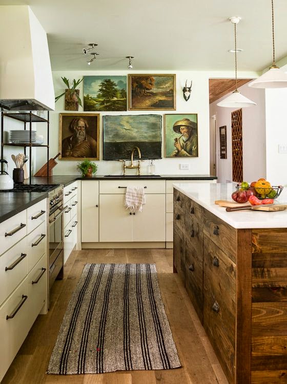
Let's rethink the look of things and save those spaces for artwork that is that special we want to enjoy it even in when we are in the kitchen. 


Our kitchens are the heart of our homes. It is full of chatter, aromas, creative cooking and baking, experiments, entertaining good friends, the best place to share a piece of pie late at night with two forks! This room is full of inspiration why skip this area when contemplating where your treasured artwork should go?


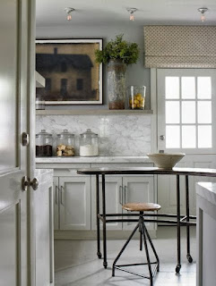
Don't get me wrong, the most important design element of a kitchen plan is having all the needed storage. Just keep in mind places to put things doesn't always have to be cabinetry. It can be bistro shelves, a marble or granite ledge, suspended wooden shelves, glass front cabinets - all great places to display artwork that has a special place on the list of your favorite things.


I love artwork and when I am placing it in the home, I'm not thinking of its appropriate spot, for it is the artwork we place in the most unexpected places that sometimes we appreciate the most.  I have even hung oil paintings in a client's garage. 


Artwork is truly at home in the kitchen. Give thought to your artwork selection for the kitchen, consider the best way to install, do it without hesitation; you survived having a band aid ripped off, you can do this. Now enjoy!


The rethinking of artwork in the kitchen may seem like a tough challenge. After all, if one puts an oil painting in the kitchen is that like wearing flip flops to church? Why yes it is and neither has anything to do with irreverence, its about including it because its not a rule breaker.

Choosing and hanging (or propping) artwork in the kitchen does still have the same considerations as other art placement, excluding the subject matter. Remember scale, size, height at which it is hung,and practicality. Don't go overboard and hang art right above your stove! A good cook is most times not a neat cook, the mess happens as the menu is being created and mastered. If the art is just filling the void without thought then you picked the wrong piece.


Okay, my troops you have your challenge! Go put some artwork in your kitchen and do me proud!


Image Sources: Elle Decor, Pinterest, Deb and Danielle, Studio McGee, Glam Pad, Instagram
Garden Design No. 20 - The Pergola


The pergola can offer a beautiful architectural element to many outdoor living spaces and can also add curb appeal to a home. As in adding any structural element to our home and landscape, great thought and research should be done prior to starting the project of adding a pergola.


There are pros and cons to the pergola, I tend to think the pros outweigh the cons. But then it could be the beauty of the structure that sways my opinion too! The pros are obvious so I won't get into those. Some things to consider if planting vines over the pergola:  attracts butterflies and hummingbirds (also attracts bees and spiders), provides shade but can be messy (vines may drop leaves and debris), maintenance (requires sweeping and trimming).


One advantage that can prevent some other cons like the promotion of dry rot because vines retain moisture are the innovation in wood alternatives. However, the beauty of a plant-free pergola might just create another dilemma in your decision to plant vines or not to. The vines to add weight to the structure as the grow and mature which is an important factor in the design and maintenance of the pergola and its location.


Sometimes the landscaping around your planned pergola location has already provided planting, like trees, that create that shade factor that is so appealing. No need to add vines, but then I say potted plantings are a must. 


The play between shadows and light that the architectural design of a pergola offers is such a delight whether plant free or vine covered. So you won't miss out on that no matter your decision to plant or not.


Vines will bring your structure to life. Living, breathing plants not only contribute to the shade factor, but they also bring color and fragrance. Here are some of my favorite picks: Bougainvillea, Chinese Jasmine, Wisteria (careful can be toxic to dogs when eaten), Passion Flower, and Royal Trumpet Vine.


The function of the pergola will dictate the final design, structural materials, vines or no vines, placement on the property and flooring, should it be a pergola for seating. I also love the entrance pergola, awning pergola, pergola over the garage doors, and by the pool.


Just as one's design style doesn't effect the feel of a room inside our home, neither does the architectural design of the pergola. Whether traditional, rustic, or modern - the pergola still holds those appealing benefits of shade, warmth, comfort, cocooning, and beauty.


Yes, I could totally see myself spending many hours under a pergola. But I also love the stunning look of a pergola over the garage, at the entrance to a home, and as an awning. Restraint is important, too much of a good thing is just that; too much!


Image Sources: Houzz, Elle Decor, Pinterest, Brabourne Farm, Home Design Collection, Beyond the Picket Fence, Only for Girls, Indulgy, Better Homes and Gardens, Squidoo


Wednesday, June 18, 2014

Rooms I Love No. 17 - Starting with the Architectural Elements

Loving the great, but understated window.

I am a big fan of layering in a room's design. Whether it happens all at once or over time, it doesn't matter. It just needs to look like it all just happen. Not forced. What I love about these rooms first is the architectural elements in each of them. Strip them down and the architectural character sets you on a journey that can only lead to a room to love.


Loving the unique window, the window seat, and the paneled walls. This is a 
room to love from the very start.


Love the arched doorway and all the great mouldings painted white.
But most of all I love the story in this room. The inherited window 
panels used on the backs of these beautiful chairs.


I love the brick archway and the beams. I love that these were
not interpreted into a dark and 
stuffy room.

I love the natural light from a great window, the uncommon size of
this bathroom, and the terrific ceiling.


I love the black painted archway. And I'm freaking out about the map 
collection hanging in the most unlikely of places. I always knew someone
brave enough to paint their trim black was brave enough to add 
another element of uniqueness in the same room.


Image Sources: Home Bunch, Greige, VT Interiors, Zsa Zsa Bellagio


Tuesday, June 17, 2014

Rethinking the Look of Things No. 49 - Mod Craftsman Style


I've begun the dream of looking for a new house. And I have to say that I am tickled all sorts of colors to see the older Craftsman-style homes being meticulously restored with a new perspective. I'm calling it "Mod Craftsman Style". It's fresh, lighter, simpler and it makes it livable and fun!


I think William Morris would have appreciated this take on Arts and Crafts. 


What a modern way to appreciate the Craftsman style but still have a room that "breaths".


I love that the color palette for a Craftsman home comes from the celebration of nature. But I love even more it doesn't have to just celebrate Autumn or just a region of the country's nature. 


I love that this style I call Mod Craftsman tells a story with many chapters. Where it can be subtle, with just a few pieces of Arts & Crafts furniture, or a collection shown in breathable way. Seems to make you appreciate pieces you might have had all along stand out and be noticed more for their beauty.


Mod Craftsman, I'm liking it!


Image Sources: Stickley, Pinterest, Decor Pad, Houzz, Tumbler, Erno Borthwick


Monday, June 16, 2014

Well Dressed Home No. 54 - Mirrors Bedside!


How indulgent! How stunning! Hanging mirrors over the night stands. What better artwork over the night stands then the reflection of your beautiful bedroom. 


The choice of the mirror design hung over the night stand should be one of simplicity. This doesn't mean there can't be a shape to them, but they should have a more mirror than frame. It's the reflection that becomes the art, a fancy frame defeats that purpose.


There isn't a set rule for the height of these mirrors, but do consider that the mirror width should not exceed the width of the night stand. There is an exception when using floor mirrors with smaller bedside tables.


Remember this is to make a statement! The mirrors in the above image are a bit too small, don't be afraid to be certain that the mirror hangs no more than a 1/2" above nightstand. So when selecting the mirror size, this is a factor in the overall height. Considering the ceiling height in the room as well.


Loving the seating area created on either side of the bed in the image above. The bedside table and chair look so inviting with the backdrop of the floor mirrors!


Be creative! The mirrors should match each other, but the bedside tables don't have to!


Image Sources: Sausalito Architect Urrutia Design, Southern Accents, Indulgy, Pinterest, Greige, Elements of Style

Related Posts Plugin for WordPress, Blogger...