Monday, December 30, 2013

Be Inspired No. 65 - Floor Screens


Be inspired to reintroduce a classic design element into your home. The floor screen adds much to a room's finish. Yet it is fore gone to often. Make room in your budget for this element and you won't be disappointed that you did. Don't and there will be something missing until you give in.


A floor screen is art in many forms. Let your creativity shine! You'll feel like a kid in a candy store, but you will eventually hone in on "the" one.


Every room has a corner, a seating piece, a need for privacy, a dead space, a bed that deserves something different, where a desk has to face a wall.  All great applications for a floor screen.


Be inspired by these great images and you'll fall in love with a floor screen.


Image Sources: House Beautiful, Barry Dixon, WeHeartIt, Pinterest, Poppy Talk, So Haute Style, My Home Ideas, Hickory Chair, Bernhardt, Danzigner Design, Hampton Decorator Showhouse, My Notting Hill, Greige Design, A  Flippen Life, Zsa Zsa Bellegio, 

Sunday, December 29, 2013

Garden Design No. 17 - Winter Outdoor Containers


During the cold winter months we are tempted to leave our outdoor containers sit dominant and empty of beauty. But the colors and textures of winter are too inviting to ignore. 


The glorious array of color from evergreens, the winter red berries, the simplicity of empty branches, the rustic appeal of pine cones. Your containers are begging to behold such splendor.


Add juniper berries, pomegrantes, magnolia leaves, seed pods, and citrus slices.


Even the birdbath can become a celebration of winter.


Even consider your empty hanging planters!


Image Sources: Deborah Silver, Traditional Home, Pinecones and Acorns, Cultivated Garden, Canadian Gardening, Black Eyed Susan Design, Pinterest

Friday, December 27, 2013

Well Dressed Home No. 48 - Game On


I can't decide if I have more fun when game nights are planned or when they happen impromptu. Either way I believe they happen more often if an area is designated for the activity. A night in is great during the winter months we are in right now. And hey, the ability to have "house rules" that trump the printed game rules are pretty great too.


You can also apply that freedom from rules when selecting your game table and chairs. It doesn't have to be a matched set. And it can be in a multitude of rooms, in a corner, in front of a fireplace, even a multipurpose table.


Set for two for that dueling chess match or for four so that the champion of that board game can finally be crowned.


So where will you be adding the game table and what fun chairs will you put with that table? And everyone knows that the money in "free parking" is for the taking when you land on that space.


Image Sources: Elle Decor, House Beautiful, Houzz, Eric Cohler, Simplified Bee, Oomph, Traditional Home

Thursday, December 26, 2013

With Restraint No. 1 - Feathers


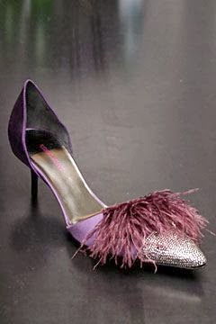
I'm adding a new category volume to my blog today. With Restraint.  The blog posts under this category will feature those great things in our home that are great because they are used with restraint. Just enough. Feathers are one of those things that add to in a just enough manner.


The color palette that inspiration from feathers can provide is divine! The saying "tickle your fancy" becomes a feeling when feathers are embraced for their color and their texture. It's hard to walk past an urn of feathers without brushing them with our hands.

This feather tablecloth is amazing.


Feather trims and faux fur...perfect combination!


The illumination of feathers is alluring.


This feather wallpaper from F. Schumacher has so many applications!


Image Sources: F. Schumacher, Pinterest, Paloma 81, Count and Castle, Haldane Martin, Etsy, Resovate, Zsa Zsa Bellegio


Sunday, December 8, 2013

Well Dressed Home No. 47 - Pantone 2014 Color of the Year


I will be honest, I always get a bit nervous when the Pantone Color of the Year is announced. It is typically a vibrant one, thus my reserve. I have never featured the introduction on this blog so as not to play any color up as a color of choice. This year is especially challenging, but I've decided to feature the 2014 Color of the Year per Pantone and to highlight how restraint is important when using a "color of the year" or a trend color. 


 The beauty of such a vibrant color such as purple orchid is most appreciated when used with a selective eye.


If this color is one you are attracted to and you want to add to your life, it can be stunning. Stunning in any setting. But please use discretion. Don't use in a way where it appears you are advertising that you are so on trend that you are shouting out the color of the year. 


As with any color we add to our lives, it should be a color we love.


Image Sources: Pinterest, Jaipur, Ralph Lauren, Zsa Zsa Bellagio, Anna French, Elle Decor, All About You


Related Posts Plugin for WordPress, Blogger...