Friday, September 29, 2023

Paper Obsessed No. 13 - Bookbinding


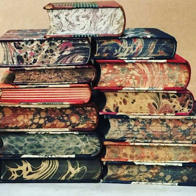
I am paper obsessed mostly drawn to vintage paper. Much of personal artwork is intertwined with framed illustrations from old books. And my love of books goes beyond the story they hold to the cover, binding, and the paper the pages are made from, especially the end sheets. I am fascinated by the colors created by the art of Suminagashi "floating ink" first used in Japan for bookbinding in the 12th Century, brought to Germany in the 17th century and then to Italy.

A trip to Paris many years ago found me looking for the "secrets" of the city of lights. Don't get me wrong, I didn't miss the must-sees and yes, I stood at the top of the Effiel Tower feeling surreal and reminding myself that I was indeed standing in this infamous place so drink it all in and commit it to memory. I still remember the hazy and chilly day and how awestruck I found it. 

On this trip to Paris the most special memory was riding the subway to discover a Paris flea market. And the treasure I brought back from that market were two leather bound books with the most beautifully designed bookbinding. Ironically both books were published in London; The Poetical Works by S. T. Coleridge and Westward Ho! by Charles Kingsley, but it wasn't the titles of these books that had me giving them a plane ride back home. It was the beauty of them. Imagining the bookmaker handmaking the marbleized end sheets, hand tooling and etching the leather covers, sewing the pages, gluing and pressing it all into a stunning package. 


The obsession of bookbinding paper for me comes from the history of the process that creates this beauty. Payhembury Marbled Papers specializes in these old patterns and describes using floating water-based paints in a gelatinous sizing that is created by boiling carragheen seaweed. 

I am loving this captured art not only in books and journals, but also in design elements for the home. How beautiful to discover inspirational takes on bookbinding in fabric, art, wallpaper, accessory pieces, lighting and more.


The ceiling design in the above image took me directly to bookbinding marble paper. The elaborate moulding is a must for this reference and the reflection in the mirror of this pattern is pure joy.


The colors of the book pages form are an inspiration that rivals any common paint deck. A stack of these books is a designer's dream to curate inspiration from. Imagine the palette of color, fabric, texture and accessorizing that can come from this! Even taking the book pages literally and creating a custom paint technique that hints at blocks of bookbinding. Just stop now!


And this design inspiration isn't just for the traditionalist. Design styles are often put into boxes along with the persons who like a particular style are put in the same confines. I find this to be a hinderance to the most well-designed spaces. We've all heard it - inspiration can come from anywhere. Then why prevent that from being the case when designing a plan? We have all been tempted to shop a particular vendor, look only in a particular place, limit design research to a certain lighting source, and reference other designers works in a designated style all based on our or our clients' style. In doing so, we have diminished the potential that a great space is giving us. 


If we believe that inspiration can be found anywhere (and I truly do believe that) than we must take down the barriers of departmentalizing interior design styles. Step into your dirty little secret of rebellion - we all have it. Ours is not to mimic style or let others define style - ours is to see something and be inspired to place it in uncharacteristic places because when that happens things are seen in a fresh light. This is not disrespectful of the original creator's intent, even if history hasn't documented what the truly was. Taking something of inspiration and using it to fit into yours or your clients' style is honoring that creator or history. Don't think vintage or historic means stuffy or stodgy, both are the furthest from the truth. 


Modern art like Alexander Calder and Joan Miro can be my interpretation of bookbinding obsession, it may not be yours and it probably wasn't at all what these artists had in mind or what the designer of this space had in mind, but it still remains mine. My inspiration when I look at these works. 


The designer of the velvet fabric on this fab screen may not have been drawing inspiration from bookbinding but it can be my story when I see this photograph and my story that I add to a design plan. We all interpret differently and are inspired differently. We need to hold onto and be proud to show those interpretative convictions. 


It is important to our souls to find out the inspiration or interpretation of a creator's product - art or fabric or poem or book or sculpture - even it doesn't match ours. Its food that feeds our creative well-being. The search for inspiration and meaning is a necessity for the creative, it is our foraging. Our design plan needs to have a story, a reason - every piece that finds itself in our plan has a purpose - nothing chosen for a space without it. This doesn't mean it needs to be the original intent of that item.


Our inspiration search feeds our creative soul although sometimes we leave morsels on the plate. Remembering those morsels left behind, dropped on the "forest" floor while foraging for inspiration haunts us. It happens to me. Things I discover and leave behind because in the moment I don't know how I would apply the find to a design plan (for my own home most often). And then I find myself including them in my musings of my blog posts and searching in hopes of discovering them again. Most call this antiquing, thrifting, spending a lazy Sunday afternoon. 

My musings about my paper bookbinding obsession may have started in Paris, but it continues. A few years ago, I found myself rummaging through an old warehouse for treasures (always with creaky wood floors for some reason) only to discover (while digging) a flat box holding stacks of paper. Paper obsessed me gasped for breath. . . and then carefully dug in with a slow reverence for the treasure before me, quietly so that no one else knew what I had just found. After all I didn't want to share. Sheet after sheet of bookbinding was piled in this box and if that wasn't enough, under it all I found these delicate sheets of transferware patterns some cut and some full sheets. Of course, it would be obvious that I picked up the box and headed straight to pay. I didn't - a life regret - I left the entire box behind because I didn't have a clue what I would do with it all. Ugh! So, I muse...


I have framed a collection of some of the quirkiest vintage paper I have found. Why didn't I think about using that box of bookbinding paper as a background for intaglios? Do I have any intaglios? No. But still. 


According to Brene Brown, a perfectionist is most worried about judgment. They have a big fear of being judged negatively by others and that is why they place such pressure on themselves to get things “perfect”. I love that even when a well-worn book loses its cover it isn't without merit - the inspiration from its pages (especially the bookbinding pages) remains for those who notice. 


Take a suggestion from me - when you see, hear or read something that inspires you - buy it, write it down, highlight it, reference it. Do whatever it takes to add it to your library so you can recall it. Things like this come into our lives for a reason. Honor them by safe keeping them for that moment. Whether it will be for us or to share somewhere down the road.


What will your ex libris show? Be inspired!


Sources: Lee Jofa, Frederic Magazine, Payhembury Marbled Papers, Kate Brett, Summerhill & Bishop, Wikimedia Foundation, Alexa Hampton, Sarah Bartholomew Design, One Kindesign, Anthropolgie, Susi Bellamy, Timorous Beasties, Architectural Digest, Pinterest 


Thursday, September 21, 2023

Rethinking the Look of Things No. 68 - The Concept of Pareidolia


I've been blessed to have an increase in the time I have been able to spend on my front porch reading this season. I'm not even close to putting a dent in my Front Porch Reading List, but the time to dust off some books in my libraries (piles here and piles there) has been so satisfying. 

The distractions have been few, but one has me rethinking the concept of pareidolia. I have had my head in the clouds so to speak as a passerby just might catch me staring up into the sky in awe of its ever-changing beauty and ever-changing dance of shapes my mind sees in the clouds. Pareidolia is the tendency to perceive a meaningful image in a random pattern and it has me rethinking how this relates to interior design. Not intentionally putting images into the design but seeing the design of a space for more - going deeper to elevate the design.


The design of our homes cannot be without meaning so the I think that a good designer needs to have the tendencies of pareidolia - to have the perception of significant patterns or recognizable images in random arrangements of shapes and lines. Whether designing our personal spaces or clients' spaces, this is a must.

The application of pareidolia in interior design is the partner to getting one with the spaces we are designing. Envisioning the space for its secrets, its calling. And then intertwining these images that come to mind with the owner's biography. 


How will this design story unfold to create the linger in its space that has the same effect on our soul that the sky with clouds does for us? To develop into an environment, we don't want to leave and that we don't want to stop revisiting again and again.

Maybe, just maybe when we are in a design slump, we need to take a break and sit under the clouds and breathe it in filling our tanks with inspiration and then back to the concept boards. 


One can only imagine the next level design that can happen from applying the concept of pareidolia at the brainstorming steps of a design project. Random, but planned. Significant, but comfortable. Meaningful, but relaxed. The perfect dance partners.


Let's get our heads in the clouds because the sky is to be marveled - a design that God renews minute by minute - season by season. A canopy we live under every day and miss seeing, may I say with consequence. 


Perhaps the inspiration from the sky will be the perfect paint color you have been looking for in your design plan. There are colors from the sky that almost seem unable to be duplicated - get as close as you can, the meaning of why you chose this color will be impactful. 


"You are my blue crayon, the one I never have enough of, the one I use to color my sky." A. R. Asher

Be inspired!

Sources: Tumblr, Schumacher, Luxe, Etsy, House Beautiful, Valerie McKeehan, Designs by Carla Aston, Pinterest

Wednesday, September 20, 2023

RSVP Collection No. 61 - Dinner is at 5


I did a thing. It was 30 years ago, but it still is talked about with fond memories. It has dog-eared pages (some splattered with ingredients) and there may or may not be notes on the pages.

Our Mom more often than not cooked without measuring. She used the "dump" method - she knew what a tablespoon of this and a cup of that looked like without measuring. And then there was always that little bit more. She did have recipes that she got from friends on index cards or cut out of magazines and newspapers, and she had lots of cookbooks. But once she'd made a recipe a few times she had it memorized or had to "doctor" it up in the words of our Dad.

When my Mom wore lipstick, it was always red so I photoshopped a kiss on Dad's cheek.


She would experiment often with recipes and my Dad would usually be the one challenging her to come up with a version of something. Like the never accomplished version of a whoopie pie not the chocolate one she'd make, but a vanilla one. She'd bake and experiment, experiment and bake and never come up with one that was a soft as the chocolate whoopie pie, but it was fun watching her try. And there were many dishes she and Dad would cook together - peeking in to say that a bit more of an ingredient was needed. His vegetable soup was one of those dishes that was different every time but always hit the spot on a cold day.

We'd often sit at the counter in the kitchen watching her make her trademark dishes without any recipe and rolling pie dough with her to fit into our miniature aluminum pie pans while eating the cut offs from the edges. I thought we'd never be able to learn to crimp a pie crust like she artfully did with ease. Her mixing bowls were always one of the Pyrex ones. I have two of my Mom's bowls, the yellow and green ones. Someday I'll have the other two colors when I come across them while antiquing. My two children grew up using the yellow one as a popcorn bowl while watching movies and I still use them to mix a batch of this and a batch of that.


At some point we wised up and ask her to write down her recipes for the dishes that she conjured up and I'm glad we did. After our Mom passed 30 years ago and when we were able to go through her things the recipe box was one of the treasures. How do we share this box of memories with all nine of her children? I volunteered to take on the task of somehow duplicating all the recipes for my siblings. It turned into my first published book. I could do so much more with the design of its pages and am often tempted to, but for some reason there's a reverence to this first go at it that whispers "leave it alone". 

I gifted my siblings copies wrapped with a pig cutting board that Martha Stewart introduced in 1994 - perfect timing. The cutting board was a memory of the ones handmade in shop (modernly called industrial arts) classes in high school. (Mom had three of them from my three brothers' handiwork.) And now both of my children have copies too and are continuing the tradition of Mom's favorite dishes. 


Farm to table wasn't a trend when my Mom cooked and baked - it was the thing that you just did. Our meals were planned around the garden harvest and the local butcher. We gardened, picked fresh fruits from orchards, purchased eggs from the Mrs. Shradley the local chicken farmer, and canned and preserved for year-round freshness. The chicken farmer also had rows and rows of gladiolus in every color imaginable that I will never forget. 

I still have the original recipe cards - I can't seem to part with them. Don't need too. Dinner is at 5 pm because that's when you found the table set and dinner ready to come off the stove every day of the week.

Be inspired to live your memories while creating new ones!

Monday, September 18, 2023

Color Palette No. 18 - Sherwin Williams 2024 Colormix


Sherwin Williams recently unveiled their Colormix Forecast 2024 - Anthology No. 1 with four color categories and I am loving them all. Don't get me wrong I have my favorites for sure!


No. 1 Blues & Greens

"This palette revolves around the color connection between blues and greens, shared across a range of organic, calming-yet-invigorating hues." (Sherwin Williams)

I'm loving the convergence of blues and greens for their organic, calm and soothing vibes while also giving off an invigorating energy just like nature. Picturing the color contrasts that can be created from this color group is a designer's dream. Think Batik patterns, sisal carpet, natural woods - rustic and refined both, glorious prints and then think sophisticated Ralph Lauren classic plaids and timeless patterns, mid to dark toned woods, chrome or brass metals - whether casual modern or transitional with a touch of formal this color palette is the starting point.


No. 2 Reds & Purples

"Get creative with this palette of reds and purples made for maximalism – a group of warm, saturated hues paired with understated neutrals." (Sherwin Williams)

I'm drawn to this color series because it is perfect for creating that cocoon, we all need for the caring of ourselves. Purples, which are tied to finding joy, have always been a personal fav of mine. And the earthy browns are always a great backdrop to striking contrasts of purples - pure poetry. Even the punch of the Dragon Fruit sparks inspiration for me.

Visions of a late summer meadow of wildflowers is what I have with this color palette. This color mix takes me back to the Chanel 2023/24 Haute Couture Fall/Winter Show. Remember those embroidered floral looks paired with the classic Chanel boucle? (See blogpost Fashion Translation to Home No. 24.) 


No. 3 Deeps & Darks

"Escape into a restful retreat with this palette of deep, dark colors. A range of dramatic hues that introduce powerful contrast and a little mystery." (Sherwin Williams)

This is my favorite! It takes a bold person to say yes to this color mix, a person that is envied because it is clear they are not afraid to be authentic to themselves. They don't save this secret love of deeps and darks for the fall season - they let it dwell in their homes every day. The saturation of color is so beautiful, it stands proud. 

What is inspiring me from this color mix? Velvets for sure, along with kilt-inspired plaids, silk fabrics in any of these colors, bronze metals, animal prints for sure, embossed leathers, worn antique woods, collections of unique objects - all with clean lines and no clutter - everything meaningfully incorporated.


No. 4 Delicate Tints

"In a palette that’s both hushed and harmonious, airy tints intermingle with soft whites to deliver elevated, minimalist style." (Sherwin Williams)

Okay this one caught me off guard. I was today years old when I learned that I love delicate tints. And I love them for all that Sue Wadden of Sherwin Williams has to say about them. I love them because "lighter tones reflect light more effectively" - "maximizing natural light not only enhances the visual appeal of a space but also promotes circadian rhythm, energy levels and overall health." This could take me away from a to-do list without guilt. Back to harmony and tranquility - back to basics. And I think I could find myself happy here (okay maybe just in one room).

I'm envisioning wormhole woods, linen fabrics, animal prints still (neutral ones), lots of architectural mouldings, gold metals, a library to die for (can you image reading around these tints), nailhead trimmings for certain, faded vintage-like print fabrics, lots of windows with black frames, faux furs, my small beginnings of a collection of white busts, lots of layering.




Okay, so what inspiration will feed your soul with from this color forecast? 


Sources: Sherwin Williams, Pinterest