Monday, August 28, 2023

Rooms I Love No. 25 - 2023 Kips Bay Palm Beach Decorator Showhouse - Part III


This is Part III of Rooms I Love from the 2023 Kips Bay Palm Beach Decorator Showhouse. Ahh, aubergine and the Welcome Bar, I don't know which I love more. This amazing space at the showhouse is the masterpiece of Errez Design Studio. Their design philosophy is to treat interiors as biographies - creating spaces that are an extension of their client's self-expression. 

The Welcome Bar can be found at the top of the guest staircase in this showhouse, and this design team grabbed you from the first step. I am loving this concept of a welcome bar to the guest quarters of a home. It's like the exclamation point to the welcome the guests received at the front door! And the coziness of this space tells its visitors to stay awhile, a long while. 


The curves of the sofa give me the feel of floating musical notes and its solid lavender upholstery and patterned pillows the perfect song against the textured walls, the dancers in the art above in harmony with it all. 

Subtle stories of journeys taken told by the accessories are the perfect complement to this fantasy room. My favorite? The busts at the bar, all decked out in their seashell finery bring a smile to my face. I'm envious of the person who played dress up with them. 


The mirrored backwall at the bar captures a reflection of a fabulous light fixture installed on the ceiling that highlights the rippling effect of the mirrored tile. This treatment is repeated in the guest stairway with an added under sea art installation that provides the opening chapter of this beguiling space. 

The many shapes in this space, like the winding staircase that leads up to the welcome bar are in sync with each other. A room that says you can go anywhere your dreams take you. 


Talk about a defining moment! The Welcome Bar at the 2023 Kips Bay Palm Beach Decorator Showhouse brought it, and I picked up what they were putting down. And thanks for yet another new vocabulary word I learned from this experience, "biographical design."

Be inspired!

Sources: Errez Design Studio, Veranda, Architectural Digest, Instagram, Nickolas Sargent Photography 


Tuesday, August 22, 2023

Translation - Fashion to Home No. 24 - Chanel 2023/24 Fall Haute Couture


Along a cobblestone runway on the riverbanks of the Seine with carefully selected stones painted in a palette of blush, pink, lavender and purple Chanel presented their 2023/24 Fall Haute Couture show. And it was filled with embroidered fruits and flowers that may seem to be delicate in nature, but boldness and confidence was portrayed without a doubt.

This is my translation from fashion design to home design inspired by this show from a few of my favorite runway looks. I literally gasped, paused, and zoomed in on one stunning creation after another. The models seemed to be strolling along the Seine as if going about their day, several with baskets of flowers that could be mistaken for a beautiful purse, one with man's best friend loyally walking next to a lady in an orange coat with gold buttons (Runway Look No. 4) glistening in the sun.


RUNWAY LOOK NO. 31


The iconic black and white boucle was embellished with the traditional gold buttons on some looks and then...then the moving still life-like paintings came with flowers and fruit and trims and even feathers, oh my! The boucle became luminous with threads of silvers, golds, pinks, oranges with the looks panels and gathers billowing from the breezes off the Seine.

In Runway Look No. 31, a coat reminded me of a wedding cake with its floral clad bodice and sleeves and boucle bottom, both immediately brought to mind floral prints for seating, tassels for dangling, and mosaics for walls and floors. All reminiscent of things that need a comeback in interior design.  


RUNWAY LOOK NO. 32


Loving the oranges, peaches, blues and yellows of Runway Look No. 32 of the embroidered floral motif on the top front and repeated on the back. This top was paired with a pleated long skirt with pockets! The top reminds me of a rattan texture with a "basket of flowers".  And my mind went straight to the adorable Anthropologie Jimena chair in the same colors and then to a Chinoiserie wallpaper that has always been a favorite of mine because of its dreamy vibes.


RUNWAY LOOK NO. 35


Ombre is the word that defined Runway Look No. 35 for me. And with its tulle-like under pinning it also lovingly validated the times when my mom would make us wear pants under our dresses when it was cold, although I don't think we looked near as fashionable as this does.

Velvet floral prints and ombre floral wallpaper are what I translate to home from this runway look.


RUNWAY LOOK NO. 16


I am a fan of moody interiors and the aubergine and purple color families have always been dear to my heart, so it wasn't a surprise when that Runway Look No. 16 was one that I watched again and again. The baubles, gold leafy vines and beaded raspberries on the delicate fabric over the pinstriped trousers marry masculine and feminine so well. Print textiles adorned with fruits and florals and moody painted walls with black woods and vintage-like upholstery pieces are vibing with this look for sure.


There is so much more inspiration from this runway show, this seems like a teaser. Treat yourself to the video from this show and be inspired to bring fashion to your home. 

Be inspired!

Sources: Chanel, House & Garden Magazine UK, Tumbler, Sofology, House Beautiful, Sanderson Design, Pinterest, Instagram

Monday, August 21, 2023

Rooms I Love No. 24 - 2023 Kips Bay Palm Beach Decorator Showhouse - Part II


This is Part II of the rooms I love from the 2023 Kips Bay Palm Beach Decorator Showhouse and yet again I'm head over heels. I have to admit I literally stared at this room like it was a tall drink of water on the hottest day of summer. If I had physically been in this space, they would have told me there is more to see and I would have replied, "I'm fine here."

Lucy Doswell Interiors' study is marvelous. Some of what grabs my heart is the borrowed Mid Century cocktail table and desk chair belonging to Lucy's grandmother. Talk about enduring well-designed pieces that can translate from room to room, for generations. 

From the wallpapered ceiling washed with gold and its jewel of a chandelier to the calming painted walls the jewel box is created. The selection of seating all gems in their own right paired with the best textiles and leather to give each one a bit of the limelight. 


I can't even with that velvet on the sofa with its button tufted seat cushion. Velvet is one of my favorite sofa fabrics. (My living room sofa is a chocolate brown velvet that I haven't tired of in the 20 years I've owned it. Invest in the best quality furnishings you can afford, and you will be rewarded with many years of enjoyable.)

The mix of fabrics in this room are delightful and the touch of turquoise leather on the desk chair is like a great pair of shoes that top off an outfit! The floral on the sweet slipper chair, topped off with the geometric trim at the hem is so darling. I'm a sucker for the wood occasional chair with its fresh awning stripe cushion. Standing ovation for using four different chair styles with four different textiles to cover them. 

The patterned carpet the ground that carries all the things is splendid. 

And hello lambrequin! What a great reintroduction of a fabulous window treatment fittingly adorning the window. If the room was a runway this would be the finale. 


The musts for a well-designed room, treasures! The burled keyed box on the desk, the bird feet candlesticks on the cocktail with the sassy turquoise tapers, the collection of mismatched art on the walls hung just so, the vessels holding foliage, floral and feather. Well done.

Be inspired!


Sources: Lucy Doswell Interiors, Veranda, Carmel Brantley Photography, Architectural Digest, Pinterest, Instagram

Monday, August 14, 2023

Rooms I Love No. 23 - 2023 Kips Bay Palm Beach Decorator Showhouse - Part No. 1


Showhouses, the inspiration juice for interior designers and this year's Kips Bay Palm Beach Decorator Showhouse didn't disappoint. Besides the joy in seeing a celebration of pattern, color, layering upon layering, vintage and modern sitting side by side and tortoise shell; I also added a fun new word to my design vocabulary from Danielle Rollins - "barmoire", love it!

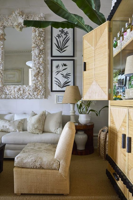
And I also fell in love with Rollins Cocoa Lounge at the 2023 showhouse. This designer turned a stunning vintage Donghia rush and mahogany armoire into a barmoire, but that's not even the beginning of it! One needs to take a long pause and gaze, (okay, gawk) so as not to miss every beautiful detail of this room. It's a journey back to the 70's and 80's, timeless.


There's a secret in this room. In this home, built in 2009 this room was designated as the dining room, but with its long distance from the kitchen Rollins decided to create this space as a cozy and comfortable entertainment area for before/after dinner drinks and conversation - or a quiet escape any time of the day. She stole my heart with the large folding screen to cover the opening behind the barmoire to create a "wall" which added to the coziness.  (I'm a fan of folding screens because of their function to add an architectural element to any space, or as an art form, or as a solution to a design challenge.)


Another reason I love this room is the use of elements that are true classics. Like the black and white floral studies that flank the larger-than-life shell mirror, Batik fabric that covers the slipper chairs and throw pillows, the coconut husk console that holds a study in white treasures, and the x-base ottoman sitting under it. Sisal and raffia at its finest - always the quiet classic in a room, but never overlooked. 

I love this room for Rollins eye for placement of every element. Not one piece in this room appears to be last minute. Not one piece was happenstance. Because I believe it was elements all brought together as a story and the pages of that story were edited to perfection.


The Cocoa Lounge is truly a room of ease. The limestone walls a suitable backdrop for the perfect mix of texture; sophisticated yet welcoming with a coastal neutral color palette that holds its owner's DNA graciously in every nook and cranny.

Welcome back 70's and 80's. Be inspired!


Sources: Veranda, Nickolas Sargent Photography, Glampad, Pinterest, Instagram, Stylebeat