Wednesday, October 17, 2018

Gotta Love No. 56 - Kelly Wearstler's Channels


It's a backstory to design elements that enrich its value to me. This is because I firmly believe that as my blog profile states, 

"I love rethinking the look of things. Bringing a little more story and personality into our homes. Loving the way we live. If it tickles your fancy, brings a flutter to your heart, or makes you feel like you just won the "finders-keepers" game of life then give it a place of honor in your home."


Kelly Wearstler's Channels pattern is one of these amazing design elements. Her design of this pattern fuses her interest in graphic street art with refined stripes, according to her website. What is it about graphic street art that tickles my fancy? There is so much to it - the bravery of the artist, the movement, the colors, and the chaotic yet seemingly planned presentation of the art on buildings and freight trains. 


The Channels pattern is one that fits even the well planned interior. It seems to be that fun afterthought to scramble things up just a bit. I am loving all nine colorways of this pattern and love the dimension it brings when used on a ceiling!


It seems to be a great scarf that is paired with a classic trench coat. The comfortable loafer that feels like a slipper. And it tops my list of things I cannot wait to use on a project; the right project.


The embrace it gives a kitchen is racy and it will be the chair taken first when friends and family arrive. It's the wall or drapery panel that is caressed by the normally composed visitor when no one is looking. Why? Because this is what happens when a room holds the unexpected and "not for everyone" element inspired by the familiar. 


Channels is one of those "wish I would of thought of using it first" design elements. An element that calls for breaking the rules of what defines traditional. It stirs the pot of branching out and expressing ourselves. All while maintaining simplicity.


Channel your inner love!


Sources: Kelly Wearstler, 1st Dibs, Apartment Therapy, Cedar & Moss, Dering Hall, Etsy, Lonny, Pinterest

Wednesday, October 10, 2018

Be Inspired No. 85 - Build Around It!


 A television commercial for Kohler has stuck with me. It features a prestigious architect giving a couple a tour of his offices narrating all the awards and accolades he has to his name, then once seated in the conference room he asked the couple, "now what can I do for you?" The wife pulls a Kohler faucet from her bag and says, "design a home around this."


I've put it in writing before and I'll do it again - our homes should hold meaning and purpose. I am inspired by a space designed to hold a piece of furniture where everything else is built around it. I am talking about a piece that holds it's throne without apology or intimidation. 


Remember this "build around" conceptual inspiration when you see a furniture piece that you just can't walk away from. The piece that captures you. For those that have experienced it you get it. I call it furniture porn. You don't want to get caught staring, but you can't look away.


Stay inspired to push the limits of building around it no matter the room. Remember we don't live in that box of rules! 


Building around a furniture piece allows you to redefine it's intended use. Give thought to how it best fits the purposes in your room. Give thought to how the hardware will set the tone for its stature. And remember the exposed interiors can be altered with a coat of paint, glass shelving instead of wood shelving, or even the addition of lighting.


Whether antique, vintage, or new; that piece that has captured you has its place in your home. Build around it! 


Sources: Traditional Home, Apartment Therapy, Pinterest, Ironstone & Indigo, Maison Boheme Blog

Wednesday, October 3, 2018

Well Dressed Home No. 61 - Traditional Minimal Design is Chic Too!


What does a designer do if they have more than one thing in a client's traditional design that they want to give a place of prominence, center stage? This is where the idea of minimalistic design comes into play. Though this design approach has most often been given to a modern, contemporary design; it is chic in a traditional setting as well.


I believe the stunning interiors born from this approach is the best way to highlight multiple individual pieces in one space. The sophisticated simplicity allows an appreciation for the furniture's curves, twists, and turns when they are allowed to stand alone in their individuality in a non-cluttered environment.


It elevates the less is more concept that delivers a never ending calmness, while at the same time giving the heart of the beholder a little flutter. The pause that happens in a traditional minimal design will have you seeing detail you missed before.


So where do you put your collected treasures in a traditional minimal design? Consider some of these tips: beautiful shelving or display cabinet, tabletops with restraint, the seat of that individual wood frame chair in the space, an easel, under an end table or console. You won't have to point out the details of your special furniture pieces - they will be noticed when one takes a traditional minimal design direction. Enjoy your new found beauty!


Sources: Elle Decor, Daryl Carter, Vicente Wolf, House & Home, Mark Cunningham


Sunday, September 30, 2018

Fashion Translation to Home No. 21 - Spring 2019 Inspiration


Adeam Spring 2019

If you want to better understand your home design likes and dislikes pay attention to those fashion runway outfits that cause you to stare. That cause you to imagine how you would interpret the outfit. Interior design inspiration is everywhere, including the runway. Be curious about what draws you in from the fashion runway, explore it. You may just find your answer to how your home design style is defined.


Be inspired by the gray off-the-shoulder trench coat with the feminine bow paired with a great metallic shoe. What a stunning, yet comfortable room this outfit translates into! 


The translation is yours personally, so take the softer gray from this outfit to a deeper hue. A feminine touch can still be achieved with a fringed throw and luxurious toss pillows.


Fashion designer, Hanako Maeda's Spring 2019 collection was inspired by Nineties club scenes in US and Japan. I selected the room above as a translation because it seems to include a nod to the dance club with it's great chandelier. The color palette is certainly verbatim to the gray trench coat outfit featured on the runway.


Longchamp Spring 2019

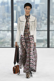
Sophie Delafontaine is quoted to say "I am not designing for static women" and her designs for the Longchamp Spring 2019 prove that. Vogue calls it an "ode to the free-spirited...". Translating this fashion runway show into room design is daringly beautiful. The elements of fringe, leopard print, flowing textiles, leather, and suede is a box full of love wrapped in bold.


Even a crystal chandelier serves as a translation to the fringe in a brilliant way for those experimenting with their free spirit. And for the one who already owns the fringed shoes and bags - a chandelier showing off a bit of that flair is a welcome smile to a room.


Yes, one definition of fringe is "an ornamental border of threads left loose", but it also means "not part of the mainstream; unconventional. If that reflects who you are, this fashion translation is all you! Go for it.


Hellessy Resort Spring 2019

Sylvie Millstein, fashion designer was inspired by abstract expressionist, Helen Frankenthaler for the Hellessy Resort Spring 2019 collection. What is catching my eyes are the long sashes that give movement in a fresh, unexpected way. Oh and those pink, rhinestone encrusted shoes which were paired in great contrast with several of her fashion runway offerings.


My selections for the fashion translation to home for this resort collection feature subtle "sashes". Like the abstract graphic metallic lines on a headboard, flowy blush window panels, the arch of a bedside table lamp, the elongated mirror design and kitchen range hood and multi-light ceiling fixtures. These touches add a flowing elegance that is noticed but doesn't shout.


Metallics in these room translations flirt with the rhinestone accent of the shoe. The degree of flirtation is up to you. But I believe that there should be a lightness to it They are fluttering eyelashes after all. 


Tailoring plays an important part in fashion translation to home. Fit these translations well to your design aesthetics like fine design should. Be brave, outspoken, and a bit sassy. Express yourself. Translate your language. 

Sources: Vogue, Flickr, Pinerest, Dering Hall, Apartment Therapy, Elle Decor, Saks Fifth Avenue