Monday, April 1, 2024

Rethinking the Look of Things No. 71 - Enhancing the Headboard


Bedroom furnishings seem to be the purchase that lasts a lifetime, rarely changed. Ironic since the bedroom is the room we spend the most time getting ready to start our day or to end our day in rest for the next day. So, it would seem we would want to give more attention to what this room is offering us in sanctuary. 

The first design tip I often give to someone seeking to make changes to their bedroom starts with breaking up the bedroom set look. Exchanging the matchy-matchy elements with functional pieces that add interest to the space. Like changing out the matching bed for an upholstered bed or headboard. Eliminating the mirror over the dresser that matches every other piece in the room and hanging a television over the dresser instead or hanging a decorative mirror over the dresser instead. Adding an upholstered bench to the foot of the bed. Changing out the top of bed and window treatments. These are quick ways to start making a difference in the feel of a bedroom with matching furniture. 

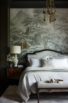
But let's take that further with another design element that will enhance the bed wall. An enhancement that draws you into a good night's dream. We often designate murals to a dining room, as rule breakers we need to realize that there are very few limitations to where you can add a mural to your home. The only rule I'd say exists is to limit your home to only one special mural. In this post we are exploring the idea of enhancing the bed wall by adding a mural or other wallpaper with mouldings. 


No matter what media or style your bed is, enhancing it with a mural or wallpaper and mouldings is definitely an option to make the bed wall have impact. This design element is many steps above just painting the bed wall an accent color. Be brave and take the leap! 


You may find that your bedroom is already architecturally set up for enhancement. Mouldings may already exist. An inset on the bed wall may have already been part of the construction. If these elements don't already exist don't fret - they can always be added. The important step is to make sure that the bed placement in your room is at its best advantage, but don't force it. There is generally only one, maybe two perfect places for the bed in a room. 


Murals can be panels printed as wallpaper or handpainted by a local artist. Either way make sure the scale and proportion of the finished product is conducive to your space. Most importantly it needs start near or at the bottom of the crown moulding and drop behind the headboard to end at the very least to the tops of the nightstands or to the top of the baseboard. The mural background color should blend with the wall color in the rest of the bedroom and for continuous continuity even the mouldings. If the background is dark and you don't want to go that dark on the rest of the walls - select a color from the mural that will be the color of the rest of the walls and mouldings.


The shape of the moulding that is framing the mural does not have to mimic the shape of the headboard. As a matter of fact, I feel that it is better if it doesn't. Just don't get too out there with the moulding application. This element is an enhancement, a backdrop - not the main event.


Keep in mind when selecting your mural palette that your top of bed treatment will coordinate with this and carry throughout the rest of the room in area rug, upholstery, window treatment, and other design elements. The mural is only one layer of design in the space and needs to partner well with all other selections in your design plan. However, don't settle on a mural and feel stuck because it's the only one that seems to work with your other selections - every element of your design plan needs to be something you love so you may need to play around with the selections until they all work well together beautifully.


Whether updating your bedroom design plan or starting fresh, be inspired to enhance your headboard! And then don't forget every other detail, especially lighting elements. 


Sources (in no particular order): Instagram, Pinterest, Behance Design, Home and Gardens Magazine, Melanie Jade Design

Friday, March 15, 2024

Garden Design No. 35 - Interior Landscape Holistic Design


As humans we have an innate instinct to connect with nature. Welcome to biophilia which translates to "love of life" which makes us crave the outdoors, find solace in nature, and be drawn to green spaces like gardens, open air parks, and even our own backyards. And in the process of feeding our biophilia we are rewarded with a wealth of wellness benefits.

Biophilia is a design gift. Live plants should be an integral part of our design plan, an important step in the layering in process. We grew up loving playing outdoors, as a grownup we get to play indoors with live plants that are not only structural and pleasing to the eye, but also provide horticultural therapy even if we don't have a green thumb. 


Plants are accepting and good listeners that thrive with simple care and attention. Caring for them can reduce stress and anxiety levels. They reward us with a feeling of calmness, boosting our mood, renewing our mental wellbeing, improving our concentration, and improving our air quality. Who hasn't brushed up against an herb plant and not paused to breathe in their aroma and perhaps went back for more? 

Even if we don't have a green thumb, we can benefit from interior landscapes by researching and choosing plants that thrive on little or care to downright neglect. And it brings joy in the selection process plants and the cachepots they will live in. It may be trial and error when achieving your interior landscape, but the rewards will make it all worth it. 


When selecting your interior landscape plants remember meaning in our interiors reaps consideration for every piece we choose to place in our home. The language of plants, like their wellness benefit, weaves a special thread throughout our home. There are few boundaries for interior landscapes it's your biophilia so whatever holistic benefits you want your plants to bring is up to you. Place them where they will thrive and grow with lushing flair. 


Interior landscape falls into the layering in of accessories process so treat placement just as you would any other accessory. Place them carefully and appropriately. And we need to discuss the cachepot, jardiniere, pottery, or clay pot your plant will be planted in. Gather a trove of containers of all sizes, shapes, and designs and then match them up with their perfect plant. Always keep an inventory of these interior landscape containers, pick them up wherever you see them because you will find the need to repot growing plants and change out pots to suit your fancy.


When you are doing your research for your interior landscape be sure to consider your lifestyle. There are plants that are pet and child friendly to accommodate those needs. And there are plants that are conducive to being sculpted into topiaries or bonsai if you want to practice that. Aromatic plants like herbs and some blooming plants are delightful in the right locations. 


Rotation of plants is something to keep in mind for your interior landscape plans. This allows for even growth and prevents plants from leaning towards the light. Make sure your containers are ones that are handled easily and convenient to rotate. An interior landscape should always feature healthy, lush plants. So, we won't tell if you name your interior landscape plants and talk with them. 


Be inspired to start or review your interior landscape plans. You will be inviting calm, lowering your stress and anxiety, purifying the interior air, and renewing mental wellness - a harmonious welcome for sure. 


Sources (in no particular order): Desire to Inspire, Fenesta, Blog Lovin, The New York Times, Tumblr, Little Blue Deer Design, Instagram, Good Housekeeping, Gardenista, Morning Chores, House & Garden Magazine, Pinterest

Wednesday, March 13, 2024

Be Inspired No. 97 - Bobbin Furniture Objet d' Art


Who knew that an ornate 17th century furniture design would become an objet d' art. Welcome back to you bobbin furniture coming in strong as a fresh and modern vibe with a vintage twist. Antiques are the new black and bobbin furniture pieces add a playful aesthetic. Lightheartedness is certainly something you can't go wrong welcoming into your design plan. Nostalgia is one of the characteristics of furniture that makes you smile. 

The spool-like turned leg design of bobbin furniture pieces makes it a standout piece with artistic appeal. It's a design that can stand in solitude and interpret the formality of a chesterfield sofa. Imagine the harmony of infusing a piece of bobbin furniture in a mid-century design. 


The turned ornamental design of bobbin furnishings is inspiring mirrors, picture frames, lighting, even kitchenware and sporting bold color finishes. But I'll keep my love of this 17th century design for tried and true worn or restored-with-love finishes. It deserves its objet d' art status so be careful where you place it and how its finished. There is something to be said for authenticity. 


The is a lightheartedness of injecting an unexpected vintage piece into your design plan. There needs to be a respect for the piece, it's design history and the story behind it, whether you find it be on an antique road trip or an heirloom piece respect it. Approach its placement with loving caution the playfulness it will bring to the space must not be contrived. 


Think bare essential when considering a furniture art piece it shouldn't be decorated like a mantel at Christmas. No bells and whistles necessary when selecting the wood finish or fabric cover. Restraint is key. Consider the fact that there is only ever one painting on an artist's easel, everything else in her studio is just background. It's the shiny penny clutched in your hand at the candy store while you look over all your choices pondering how each will taste before you tell the shopkeeper your selection. 


Now remember we live outside the box so don't give a thought to restricting a piece of bobbin furniture to a contemporary setting. We live in a design world where stuffiness is not welcome in or design plans, the living room isn't saved for Sundays. Playfulness is welcome with any design style. The approach for placement doesn't change, the bobbin furniture piece is still an art piece. Be a mixer not a matcher. An art piece disappears if it matches its surroundings. Art is meant to mix things up. 


Opposites attract even in the design world. Be a maximalist or a minimalist the Garanimals haven't been a part of great design for a long time.  Bobbin furniture pieces cross both the traditional and contemporary lines. It's understated yet has made its mark in history and continues to stand tall.


Be inspired!


Sources (in no particular order): Luxe Source, House and Garden Magazine, The Design Files, Vanguard Furniture, Alfred Newell, Rottzooi, HGTV, Pinterest, Instagram

Monday, March 11, 2024

Interior Design Reference No. 6 - The Naked Console


I call it the naked console when the floor space beneath a console is left undone. I am not a fan of design clutter, but I am also not a fan of a blank canvas. The most forgotten areas of a design plan are the final layering in of finishing touches and ceilings. This is where the naked console happens. We'll talk about forgotten ceilings in a future post. 

If a console with an open base, even if there is a stretcher, has been chosen for your design plan avoid the naked console by not only considering the design elements that are going to be showcased on the top of the console but what will be layered in below the console. It is like a perfect wine pairing - contemplate the wine notes and how they will affect the taste of its food counterpart. 


Take heart in that the solution to the naked console problem can happen as soon as you are aware the problem exists. Approach this solution just like you would any other by giving it thoughtful respect. It is not something to rush into unless you get that aha moment of clarity that finally, you have found those design elements a place you to reside. 

A well-designed naked console takes a lesson in the art of pondering. The art of pondering is a place where silence, daydreaming and wonderment are welcome and necessary. If you've been around any good designer, you have seen the art of pondering. It can be reflected by their stare is either on the table that holds a project's design elements and inspiration or on a single spot on the wall as they mentally envision.  Their posture is a bit relaxed as they practice the art of pondering. 


Our home is too important to allow undone. Haphazard is not part of your home's completion. There will be naked consoles and other blank areas that are pending. Just have a plan in place and keep these areas on your design to-do checklist. The plan doesn't need to be finalized it just needs to be a plan to complete and we need to be playing around with options we own or sketching out what we thoughtfully ponder as possibilities. 

Design is joy! Remember that. It is learning and choosing what helps us live a life surrounded by design elements that comfort us. It's our Calgon. 


“Don't Just"

Don't just learn, experience.
Don't just read, absorb.
Don't just change, transform.
Don't just relate, advocate.
Don't just promise, prove.
Don't just criticize, encourage.
Don't just think, ponder.
Don't just take, give.
Don't just see, feel.
Don’t just dream, do.
Don't just hear, listen.
Don't just talk, act.
Don't just tell, show.
Don't just exist, live.”
― Roy T. Bennett, The Light in the Heart


The naked console with its unwritten space underneath is your design biography - it can be a short, simple yet profound story or it can be a story full of illustration. Sketch out your draft, ponder it and then layer in the final vignette. Juxtaposition will become a design triumph. Yes, the design elements can be functional but think beyond that. Think opposites attract. Think contrast. 

Ponder a simpler console surface and clean wall backdrop to reserve the drama for the floor area under the console. Throw caution to the wind and display your collection of busts or blue and white Chinoiserie under the console instead of on the console. Prop the cherished small but mighty painting on the floor under the console rather than hanging it over the console. Ponder, and then ponder again.


A well-chosen basket under a console is fine. Anyone can do fine. Ponder the shape of the baskets, who was the artist whose hands wove the basket? Are the baskets placeholders until your find the right design elements? Remember temporary still needs to be beautiful and be meaningful. Don't opt for ordinary. If it isn't either beautiful or meaningful opt to leave the canvas blank.

Proportion, scale, and harmony are design principles that are vital to the naked console dilemma. Remember it's a pairing. Shoes make the outfit. (Don't take that literally - don't use the naked console floor area as a mudroom to toss your shoes!)


We are rule breakers first so room designation has nothing to do with this naked console discussion. A piece of furniture has no limitations in our home. Where you place your console has no concern over how you layer it and treat the blank floor area below it. A console is such a versatile and wonderful piece that can be placed anywhere in a design plan. Floating, dividing a room, greeting at an entrance wall, in the kitchen holding prized culinary books and the same accessory consideration you'd give it in any other room, at the end of the bed, in the bath. Length, shape, mixed media, embellishment, style, vibe - all factors in selecting the right piece. So that all seems a tad overwhelming but it's not. Just ask yourself why you are drawn to a piece. If you don't know look again until you can answer that question. Find joy in your selections, every one of them. 


What a delight it can be after pondering the naked console to find out that you can look for design elements that otherwise may seem too oversized on top surfaces. You have approximately 26-30 inches of height and a horizontal landscape of space that varies depending on the length of the console to design. The depth of the console is a small factor. There is no rule that says what you layer in under your console is limited to the depth of the space - if it doesn't impede on traffic flow and your shins don't curse you color outside the lines. 


I always write and speak about thoughtful design and in this post touch on the art of pondering a design plan. And I am intrigued with the art of hygge the Danish and Norwegian concept that encompasses the feeling of quiet comfort. And I love the Japanese philosophy of wabi-sabi, the perfection of imperfection. These are all great concepts to apply to designing well. And the Brits have a space in their home they refer to as the snug. This is traditionally known in America as a nook, but I love the reference to snug so much better. 

Recently I was introduced to the principles of Japanese ikebana by Vicente Wolf who almost always follows these principles when he is composing a setting. In ikebana, the Japanese art of flower arranging, blossoms, branches, leaves, and stems find new life as materials for artmaking. In contrast to the western habits of casually placing flowers in a vase, ikebana aims to bring out the inner qualities of flowers and other live materials and express emotion. Wolf applies this to a setting typically in a three-part structure that represents the heavens (tallest component), humans (medium component), and the earth (smallest component). 

These two paragraphs are a long definition for thoughtful and meaningful design but there is no other way to explain it in the context of the reverence it deserves. 


Travel to a place, wherever it may be, that allows you to shut out the things like design rules, design trends that are not your aesthetic, shiplap, color of the year, traditional, transitional, modern. Now with a clear mind start dreaming and pondering what you have seen and felt that brings you joy and translate that into your design plan. It's a mood, a vibe, that's your home. Journal all these things, sketch these things, photograph these things. Congratulations you have just started your design file. 


The art of pondering will catch you having read this post looking at consoles differently. You will hear how that empty space under the console, the naked console cries out for its moment. Your design file and journal will become simply extraordinary filled with hygge, wabi-sabi, ikebana, and the importance of snug. A blank canvas will become your thorn. You'll want to transform, feel, act, and live your design plan in a new way. This is the fun of design. Dance it out, you've found the joy of design.


Be inspired to become familiar with blank canvases like the naked console. The concept of layering will be like pulling on that favorite sweater. Hello friend I'm here to take your hand and finish your design plan for this home.


Sources (in no particular order): 1st Dibs, Glass of Bovino, Architectural Digest, Arteriors, Atlanta Home, Decor Pad, Habitually Chic, House and Home Magazine, House Beautiful, Instagram, Materia Designs, New York Social Diary, Pinterest, Tumblr, Simple Details, Nathan Turner

Related Posts Plugin for WordPress, Blogger...